


You know that feeling when you click a link and, within three seconds, you just know. This feels right. The colors work. The words make sense. You actually want to scroll.
That is good landing page design doing its job quietly. You do not notice it. You just feel it. I have studied landing pages for years. Some make you want to buy instantly. Others make you leave so fast you forget the brand name.
The difference is not luck. It is intentional design. Real decisions based on how people think, scroll, and decide.
So here are 45 examples that actually work. Not just attractive layouts. Pages that convert. Pages that move people to act.
What Makes a Landing Page Actually Work?
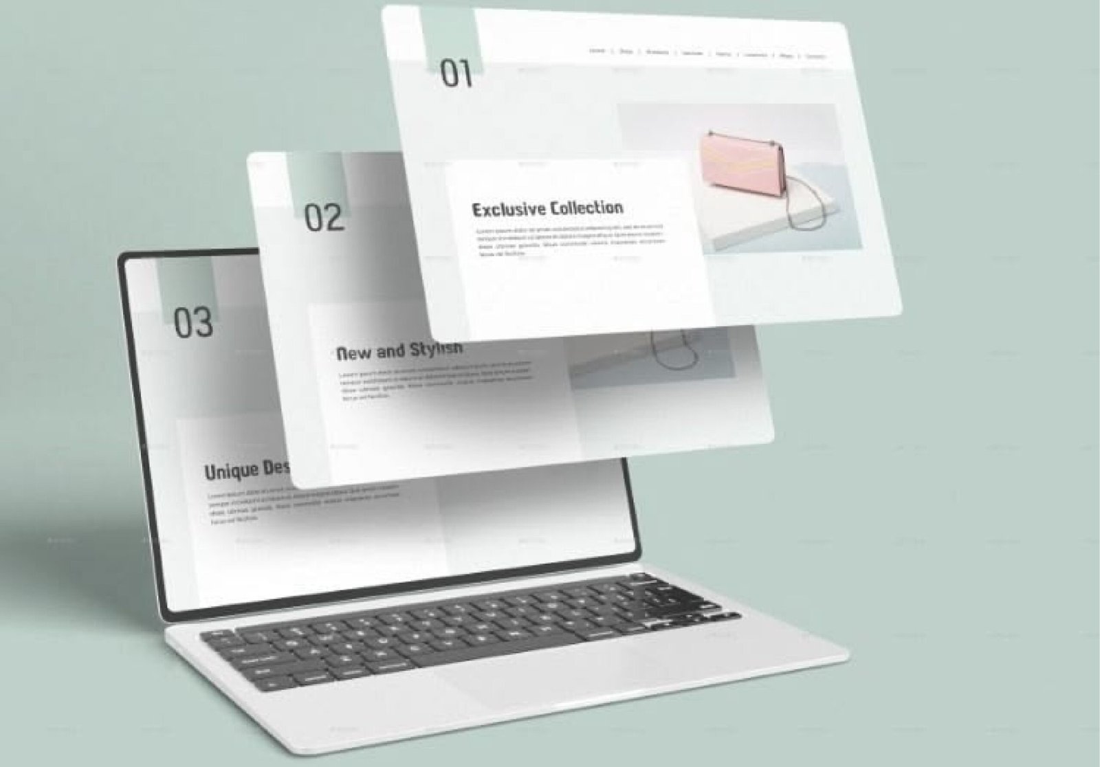
A website landing page is not your homepage. Your homepage is busy. It has menus, links, navigation bars, and multiple goals. A landing page is focused. One message. One offer. One action.
The best landing pages that convert remove distraction. They guide attention in a straight line. They say:
Here is the problem.
Here is the solution.
Here is what to do next.
That clarity is powerful.
The Ones That Stop You Mid-Scroll
1. The Storyteller
Instead of listing features, it tells a story. It sells emotion before it sells function.
2. The Color Explosion
Bold, confident color palettes stand out in a world of safe blue and white designs.
3. The Subtle Motion Page
Soft animations triggered on scroll make the experience feel interactive without overwhelming the visitor.
Pages That Build Trust Fast
4. The Real Photo Page
Authentic team photos outperform stock images every time.
5. The Social Proof Wall
Testimonials stacked together create momentum and credibility.
6. The Logo Strip
Recognizable brand logos instantly signal authority.
Trust reduces hesitation. And hesitation kills conversions.
Clean and Focused Pages That Sell
7. The One-Product Page
Everything on the page supports one offer. No side paths.
8. The Long Scroller
A structured journey: pain points, solution, proof, pricing, FAQ, and CTA.
9. The Short and Punchy Page
Minimal copy. Strong headline. Immediate action.
Different lengths work for different awareness levels.
Pages That Feel Like a Conversation
10. The Question Hook
A specific question grabs attention and creates instant relevance.
11. The “You” Focused Page
Copy written around “you” instead of “we” feels personal.
12. The Problem-Agitate-Solve Page
It deeply explains the frustration before presenting relief.
When visitors feel understood, they stay longer.
Visual Styles That Stick
13. The Big Hero Image
Full-screen visuals create emotional impact instantly.
14. The Custom Illustration Page
Hand-drawn or unique visuals give brands personality.
15. The Video Background
Motion is the fact that everyone is interested in movement rather than immobility.
Perception is influenced by visual design prior to the reading of a word.
Tech and SaaS pages that simplify complicated concepts.
16. The Software Demo Page
Screenshots and walkthroughs remove uncertainty.
17. The Comparison Page
Feature breakdowns help users justify their decision.
18. The Clear Pricing Page
Transparent plans reduce friction and improve conversions.
Clarity builds confidence.
Pages That Feel Personal
19. The Quiz Funnel Page
Interactive questions create customized experiences.
20. The Geo-Targeted Page
Location-specific messaging increases relatability.
21. The Limited-Time Offer Page
Actual scarcity is an incentive to make decisions faster.
Emotional investment is raised by personalization.
Landing Pages that Work in E-commerce.
22. The Product Story Page
Storytelling is the addition of emotional values to tangible goods.
23. The Detailed Size Guide
Clear measurements reduce returns and increase trust.
24. The customer review-focused page
User-generated photos increase authenticity.
When shoppers see people like them, confidence rises.
Nonprofit and Cause-Based Pages
25. The Impact Breakdown Page
Specific dollar-to-impact explanations build transparency.
26. The Human Story Page
Faces and names build emotional connection.
27. The Progress Goal Page
Visible funding goals create urgency and shared purpose.
Emotion drives action more than logic alone.
Growth-Focused Pages
28. The Email Capture Page
Simple opt-ins nurture long-term leads.
29. The Free Resource Page
Giving value first builds trust before selling.
30. The Waitlist Page
Pre-launch pages create anticipation and demand.
Not every landing page sells immediately. Some build relationships first.
Creative Rule-Breaking Pages
31. The Text-Only Page
Strong typography becomes the design element.
32. The Micro-Animation Page
Small icon movements guide attention naturally.
33. The Dark Mode Design
Black backgrounds feel premium and modern.
Standing out sometimes means breaking convention.
Educational Sales Pages
34. The Authority Article Page
Long-form content builds expertise before offering a product.
35. The Transparent FAQ Page
Addressing objections honestly removes doubt.
36. The Step-by-Step Process Page
Clear process visuals reduce confusion.
Education builds authority. Authority builds trust.
Community-Focused Pages
37. The User Photo Gallery
Real user content makes the brand feel alive.
38. The Community Q&A Page
Peer discussions increase transparency.
39. The Event Landing Page
Webinars and live events create engagement beyond a single visit.
Community strengthens brand loyalty.
Mobile-Optimized Landing Pages
40. The Large Button Layout
Thumb-friendly CTAs improve usability.
41. The Single-Column Scroll
Straight vertical flow simplifies navigation.
42. The Performance-Optimized Page
Fast load speed prevents drop-offs.
Mobile experience often determines conversion success.
Pages That Improve Over Time
43. The A/B Tested Page
Continuous testing improves headlines and calls to action.
44. The Feedback-Driven Page
Simple visitor feedback tools refine messaging.
45. The Frequently Updated Page
Fresh updates signal relevance and authority.
Optimization never stops.
Tools to Build Your Own Landing Pages
If these examples inspired you, the next step is execution.
There are many top landing page software platforms available today. Some focus on drag-and-drop simplicity. Others offer advanced customization for designers and developers.
Choose a tool that fits your skill level. But remember, the tool is only the beginning.
Test layouts. Adjust copy. Experiment with CTAs. Study behavior. Refine again.
And if you need support beyond design, our Digital Marketing Services can help you manage strategy, traffic generation, and optimization together.
What 45 Pages Taught Me About Landing Page Design
After reviewing so many marketing landing pages, one truth stands out. Great landing page design is not about flashy effects. It is about clarity and intention.
Clarity in a headline.
Clarity in visuals.
Clarity in action.
When someone lands on your website landing page, they should instantly understand what you offer and why it matters. The strongest landing pages that convert remove friction. They guide attention naturally. They anticipate objections. They make the next step obvious.
Colors influence mood.
Structure influences flow.
Copy influences decisions.
But empathy influences everything. If your page makes someone feel understood, they will stay longer. They will scroll further. They will click more confidently.
And that is the real goal. Because when landing page design is done right, it does not just look good. It performs, it converts, and it turns attention into action.
Conclusion
People-based understanding is at the end of the day what constitutes good landing page design. These 45 examples reveal the way it is done. I would hope that these examples of designs inspired you in the coming project. Now go build something great. It is important to remember that the optimal landing page design is not obtrusive. It silently causes people to desire to remain.
FAQS
What is the difference between a landing page and the homepage of the site?
There is no end of where you can go on a home page; the landing page just asks you to do one thing.
What makes one landing page more successful than the other?
They address the necessity and do not present you with a large number of options that can bewilder you.
What is the appropriate length of my landing page?
Not too long and too short such that a person is not bored with scrolling.
Do I need pictures on my landing page?
Yes, but real photos work better than fake stock images that everyone has seen before.
What colors work best for landing pages?
It depends on your brand, but buttons should stand out so people know where to click.